- The Perspective
- Posts
- Last-minute BFCM homepage fixes - #57
Last-minute BFCM homepage fixes - #57

Hey, everybody!
We hope you are doing well. The year is coming to a close, but that doesn't mean we are out of ideas to share with you.
Even the best website has issues. As we go cruising into this Black Friday/Cyber Monday, let's think about a few things that you might be doing wrong and stop them before they start:

We love the Coteries website. It has fantastic design, and the messaging is great. There's just one problem: that crawl bar across the top isn't clickable. So, if somebody wants to take advantage of that offer, they have no idea how. If you've got an implicit CTA on your website, make sure you make it explicit.

Keeps has a brilliant website, but the hero carousel automatically advances. Nothing interrupts trying to grok the finer details of high-priced construction than having it suddenly shift when you're not expecting it and taking you out of the moment.
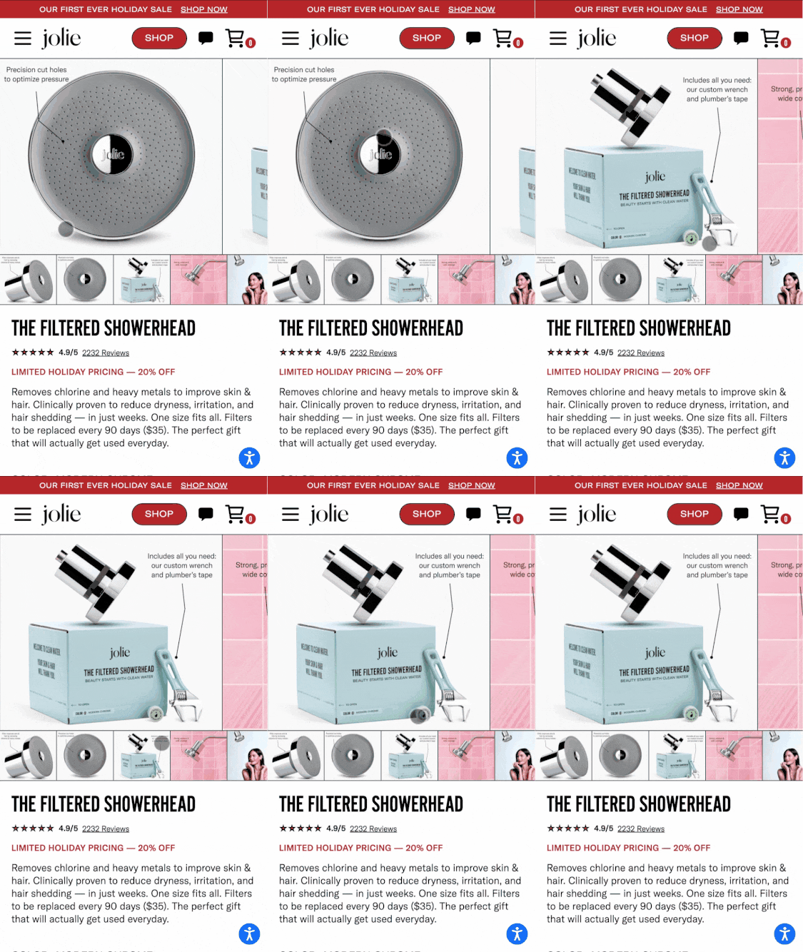
Your product photos can be a secret weapon showcasing details about what you are selling that people don't even know. If you're not showing people how nice your packaging looks if it looks nice and what you're including in the package beyond the bare thing they bought, you're missing out on ways to show value add and get people more excited to click that buy button.
Jolie has been one of our favorite brands to work with and they do a fantastic job of that in the above screenshot.
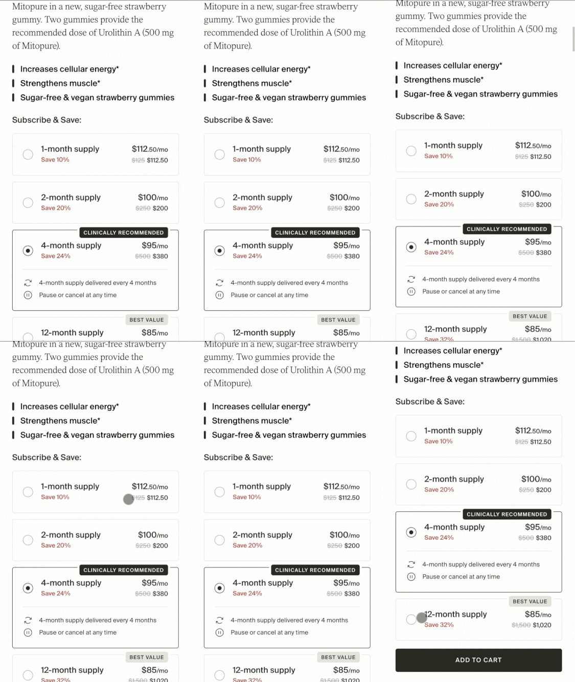
More than half of our supplement and wellness clients make this mistake. If you have a subscription service that is sticky and people tend to love, don't even offer a one-month trial. Or, at least, if you do, hide it as some little less obvious.
You'll make a lot more money for the people who sign up, and your cost per acquired user will be much more sustainable to grow your business through Black Friday.
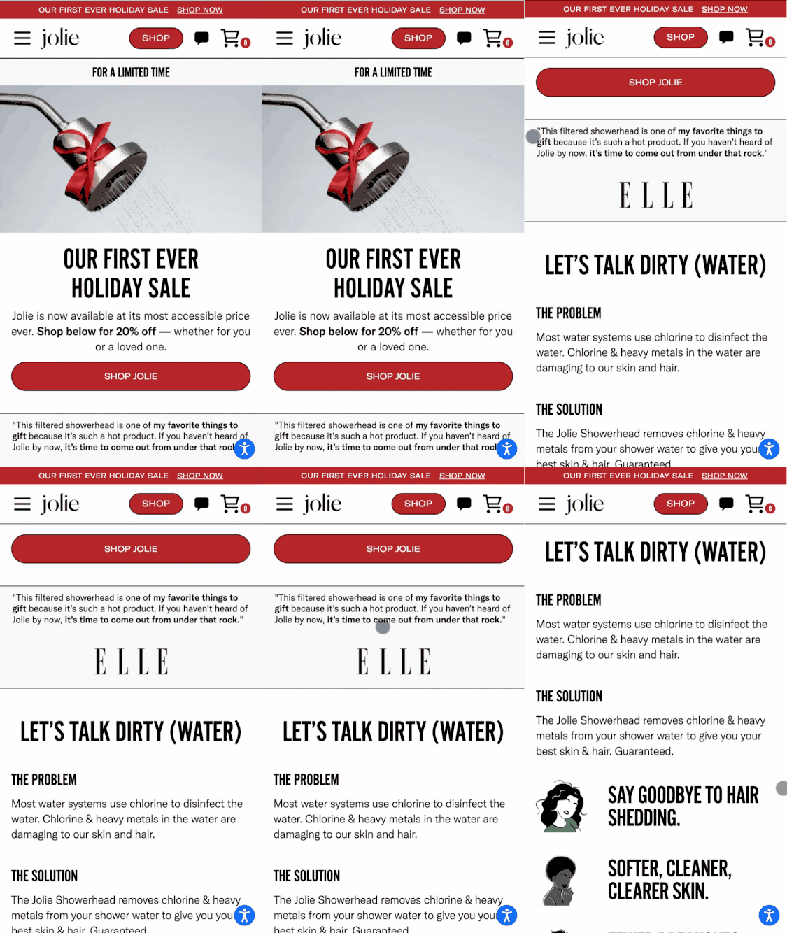
Another thing we love Jolie for is how good a job they do of calling out the problem that you need fixed and the solution to solving that problem in their page when people first hit your page.
Remember, they don't know who you are, we don't know what ad or other piece of content they may be coming from.
Being very explicit about problem-agitate-that means make the problem feel worse and that solution in a landing page can go a long way towards getting your ideal buyer go from “what?” to “wow!”
it is the end of the year, and now is not the time to get an Oddit report and try to implement it before the year turns.
But if you're ready to start 2026 with a whole new look and a whole new you?
Then you need to know that Oddit now offers development as well as UX optimization.
You want to know more? You know you got to hit that button below.
That wraps up issue #57 of The Perspective!
but keep your eyes open, because we're going to end the year with a bang, and make sure that we keep sending piping-hot new UX takes straight to your inbox.
Shaun & Taylor
Reply