- The Perspective
- Posts
- The Perspective #9
The Perspective #9
Oddit Team
July 13, 2022
Welcome to the ninth edition of The Perspective by Oddit!
Twice a month we send out actionable tips for creating brand-first and conversion-optimized customer experiences from the best in DTC.
In this edition 🗞:
Brand-first breakdown with Carnivore Snax
5 questions with Cadence founder Steph Hon
Mobile Menu tip you must test ASAP
If a friend or colleague forwarded this to you, subscribe so you don’t miss anything! And if you're curious to learn more about Oddit book a time to chat with our Co-founders Shaun & Taylor!
If you missed our last editions, you can read them here!
Brand-First Breakdown: Carnivore Snax
Carnivore Snax creates snacks made from 100% Grass-fed & regeneratively raised meat.
We're breaking down their site and offering a couple of tweaks to make it an even better user experience and conversion machine. Let's jump in!
Mobile Navigation

Suggestions to test:
Suggestion 1: Simplify the copy on the announcement bar, and thicken the font-weight.
Suggestion 2: Move the menu to the left side, and leave the cart on the right side.
Suggestion 3: Update the cart icon to something that doesn’t expand in size when items get added. Currently, the cart forces the layout of icons to break when you add more items.
Empty Cart

Suggestions to test:
Suggestion 1: Add some brand voice to the empty cart to make it feel more cohesive with the overall site experience.
Suggestion 2: Surface the top 2-4 categories or products that most users are looking for. Use the whitespace you have and visualize them!
Suggestion 3: Consider offering a secondary action to shop all products (or even best sellers)
Filled Cart

Suggestions to test:
Suggestion 1: Condense each product in the cart to a simplified card.
Suggestion 2: Increase size/accessibility of quantity selector.
Suggestion 3: Make the remove action less prominent – make it grey rather than red.
Suggestion 4: Remove the auto-add functionality of the insurance. It offers a poor experience and makes users think they have 2 products in their cart suddenly. Change it to an option they can add.
Suggestion 5: Move "continues shopping" below the checkout button(s).
Why Users Should Care

Suggestion 1: Call out the farm loudly, and directly on the image!
Suggestion 2: Increase the headline format to pack a bigger punch. If the user reads one thing, this is it.
Suggestion 3: The items are already in a list, just make them easier to read. The benefit of lists is they can be scanned/read more easily – but only with visual cues!
Product Page

Suggestions to test:
Suggestion 1: Test removing the breadcrumb – it really isn’t adding a ton of value based on the number of SKUs.
Suggestion 2: Pull the price and reviews up the page so they are in full view. Make the reviews a link that scrolls users down the page if they want to read some!
Suggestion 3: Rather than just stating the product title, tell users the category it’s in, or rather the type of meat it is!
Product Page - Part 2

Suggestions to test:
Suggestion 1: Pull in 2-3 key traits of the product – what makes it amazing?
Suggestion 2: Rather than making users click each variant to see price, show the price beside the variants!
Suggestion 3: Make the add to cart button the loudest element on the page.
Suggestion 4: Pull the payment options banner directly below the add-to cart.
Suggestion 5: Lastly, pull in a punchy, simple piece of social proof directly below for some added value.
If you enjoyed these tips, reply to this email and let us know. We love feedback :)
Founders Five 🖐

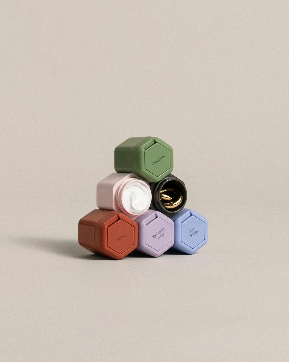
Founder: Steph Hon is the Founder & CEO of Cadence, which makes customizable, magnetic, leakproof containers designed to help you maintain your routines, home and away.
Oddit: When you were designing the Cadence capsules, what did your validation process look like?
Steph: We believe strongly that to obsesses over each small decision is how we bring products back to a time of longevity (remember how our grandparent's stoves used to last years?) and joy.
Painting a picture of our process with an example – we wanted to round the inside bottom of our Cadence Capsule so it would be extremely easy to clean and get out that last bit of product. What we would do is iterate 10-20 possible angles, narrow down to a handful of options to 3D print, review the prototypes, and either move forward or go back and iterate.
We worked through each decision with a fine toothed comb, did numerous focus groups, and ultimately took the time to make each and every decision intentionally – with the added benefit that I was building a product I wished I had so it was easy to make the call.
Oddit: What’s one of the hardest challenges you’ve faced when designing & manufacturing the capsule and what would you change about the process knowing what you know now?
Steph: I know our engineer would say that everything about our product is hard to manufacture – which is why it took us years to go from sketch to cutting steel for our custom tooling. As for what we would change, I'm not sure there's much the team would say we would change, as now that we are a growing company we have a lot more resources then we did three years ago!
Oddit: On your website, you state “We design from the intersection of dance and engineering.” Can you walk us through the meaning of this?
Steph: One of my majors in college was dance, and I grew up studying movement in all its forms. Starting Cadence, I brought in my belief that the way we move impacts the way we feel, which means every product we interact with makes us feel something.
So much of our design process was studying how an individual would experience and interact with the product. Does it fit well in your hand? What movement does our product cause the user to do? How does that movement feel? This type of deep-dive, for us at least, yielded a design everyone said was impossible to make. This is where engineering came in.
Our first full-time partner was our lead of Engineering, Graeme, who went about making the impossible possible. One can't exist without the other, and Cadence hangs its hat on the fact that we invent products that don't exist, and we do it all in-house.
Oddit: What’s the craziest or most unique thing you’ve heard of customers using capsules for?
Steph: Storing their kid's teeth :)
Oddit: Besides your capsules, what other product do you ALWAYS have with you when traveling?
Steph: I always use a fanny pack cross body when I am traveling so that I can be as hands-free as possible. The bag I use the most is my black Azaria bag. It's all vegan leather and goes with almost everything.
BONUS: With everything going on in your life, how do you manage your time and what tools do you use to help?
Steph: Superhuman, and I religiously follow the Getting Things Done model. The advice I always give is that productivity poison is "sprinkled" meetings throughout the day, so I do my best to be protective of the calendar for me and the team.
Mobile Menu Tip!
Mobile Menu Tip: add in your primary action to reinforce your offering and make it accessible at the bottom of the page
Bonus: Include your shipping offer right below the action.
— Oddit 👀 (@itsOddit)
6:57 PM • Jul 6, 2022
Classifieds 🔎
🔵 New brands we discovered this month: FFUPS, Ripit Grips, 7 Flower, and Work Louder
⛑ Save the scroll: how to optimize your FAQs
💻 Oddit Co-founder, Shaun Brandt, gives his 3 most important website tips
🚀 We're launching Email & Paid Media Oddits very soon - jump on the waitlist here!
Want your own brand-first breakdown? 🚨
Check out the essential and premium reports!
If you don’t find any value you’ll get all your $$ back. No questions asked.
The Perspective is written by Shaun Brandt, Taylor Davies, and Thomas Schreiber
Was this email forwarded to you? Sign up here.
Oddit in the Wild
🐥 Follow us on Twitter
🚀 Learn more about Oddit
🎧 Listen to our Co-founder Shaun on your favorite podcasts
Adspend: "The proven CRO playbook with Shaun Brandt"
DTC Pod: "Shaun Brandt, Oddit. Conversion as a service."
Marketing Millennial: "Brand-First CRO with Shaun Brandt"
Goodo Studios: “How to build a brand focused website with Shaun Brandt”
Reply